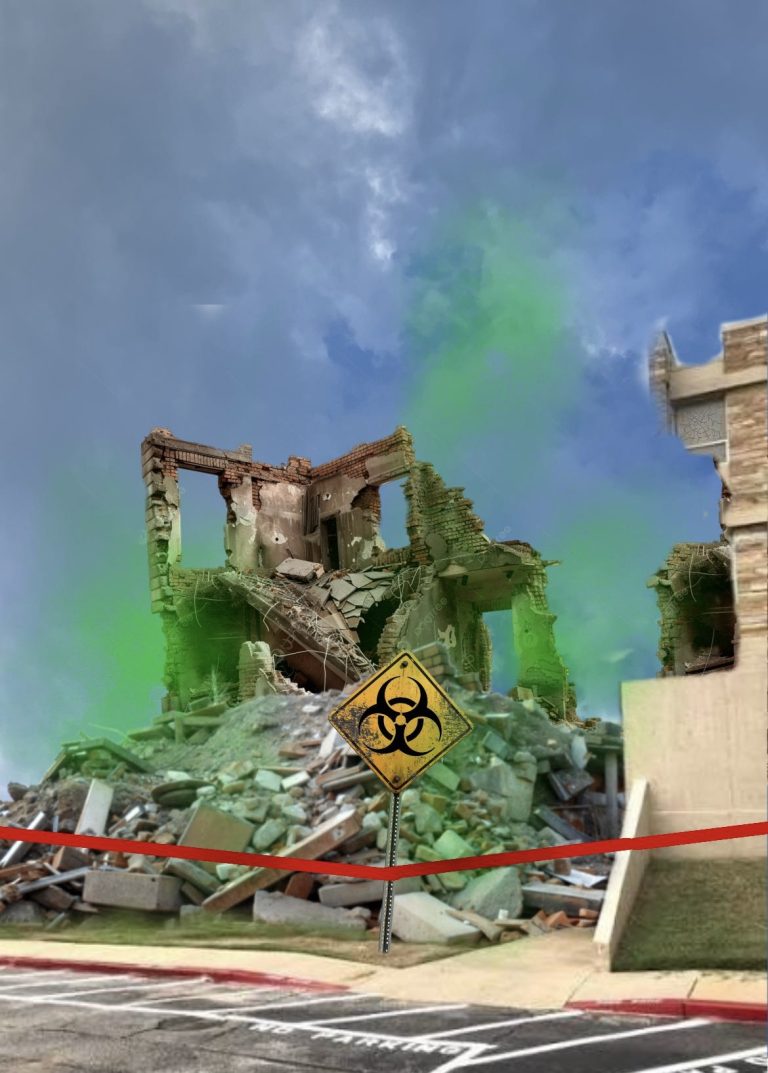
The new Utulsa website has raised considerable controversy since launching on February 2. Critics have taken note of how, amongst issues of navigability and design, the site crashed within 45 minutes of its launch. Among these critics is a young man named Gordon Aoyama, a business and accounting major who took a web design class his freshman year and claims he could design a better site.
As soon as he got the email about the new website, Aoyama said he knew it was going to be terrible. “I took Intro to Web Design,” says Aoyama, “so I’ve got a pretty good eye for this kind of thing, and I just knew it was going to be terrible.”
The list of issues he has with the new site is seemingly endless and ranges from font family and color scheme to the width of margins and navigable scroll-down menus. “The old website had its problems,” says Aoyama. “But… 16 point font? Are you kidding me?” To illustrate his point, Aoyama opened up the “Inspect Element” window on one of the new site’s buttons, only to begin sweating when he saw that everything wasn’t written using HTML 2.
In an obvious attempt to reestablish his credibility, Aoyama brought up the issue of the site’s navigability. “I had the placement of all the old categories memorized,” he complained. “But now that they’re all in one convenient place? And the menu scrolls down? Don’t even get me started.”
Aoyama continued to point out minute issues with the website’s design until we had to cut him off, saying we “really had to run” and “it’s been nice talking,” but really we just wanted an excuse to get out of there since he obviously had no idea what he was talking about.


